Posts

Showing posts from May, 2022

Portfolio

Image
At the end of the class we made a portfolio of all the projects that we done for the class, it reminded me how much work that I had to put in this class, and that's not a bad thing. The work made me feel more prouder into the projects I did.  

Animation

Image
 The animation project was defiantly the most time consuming project I ever did for this class. But that's what makes me more proud of it because it took a lot of work out of me. The animation is about a haunted lamp that turns itself on and off to reveal a letter that says, "Will You Let Me Out?" with the option "Yes" or "No". Obviously, the protagonist (me), checks off  "No", after that the lamp turns itself on and off again. It reveals that the "demon" checked off "Yes", and ends standing right behind him. 

Autoscopy

Image
 In this project I used a bunch of images group together to make an graphic image to portray a curtain meaning. In this image, it portrays that death can come any second, but that's what should make people want to enjoy their lives more, before. it all ends. Symbols in this project were a skull (death), the sun (life), and the inverted version of is supposed to show what I would look like if I died and became an angel

Multiplicity

Image
 In this project, I also used photoshop to "multiply" myself into one photo, which is just me eating all the snacks that my girlfriend got for me. It was kinda difficult to take the pictures though. 

Somewhere

Image
 For the somewhere project I used photoshop to place myself in the movie "Sid and Nancy", which is about a bassist player in the rock band, "Sex Pistols", and his heroin addicted girlfriend, Nancy. At the end, Sid was caught in the bathroom next to the deceased and stabbed body of Nancy.

Black and White To Color

Image
 I used my high school graduation photo for this project because the great lighting made it easy to use the image as a black and white photo. I used soft and light colors to brighten up the image some. I used color schemes that had high contrast within each other.

Poster

Image
 This project was another Hall of Fame! In this one we used color schemes added onto our face to make a poster, with a saying on it. I chose "Brighten Up Some!", because its always important to stay under control when frustrated. I used mainly the primary colors, for the high contrast and the "brightness" within them.

Calligram

Image
 This was probably the best projects I ever did for this class, it was also the first project to get into the Hall Of Fame! Compared to the projects before this, this one looks a lot better! Most of the words I used for the calligram was to tell my future self to make good choices and to remember who and what we're still living for.

Logo/Business Card

Image
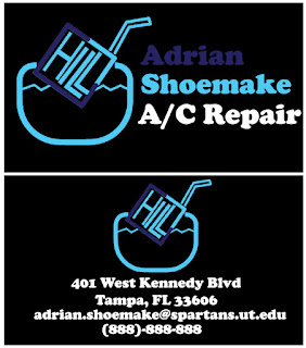
  This was the logo/business card project! I chose to make the word chill into an ice cube, using the letter "C" to almost make a square and turned that square into an ice cube. This was also a difficult project for me because this was my first time using adobe Illustrator, but I made it somehow work for an made up A/C repair company.

CANVAS

Image
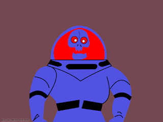
          For the canvas project I chose to do the Spooky Space Kook from Scooby Doo, because whenever my uncle would baby sit me, he'll put on Scooby Doo and gave me a Pop-tart to eat for breakfast. Thhis was probably the most difficult project I ever did for this class.